Mashhad Municipality Platform
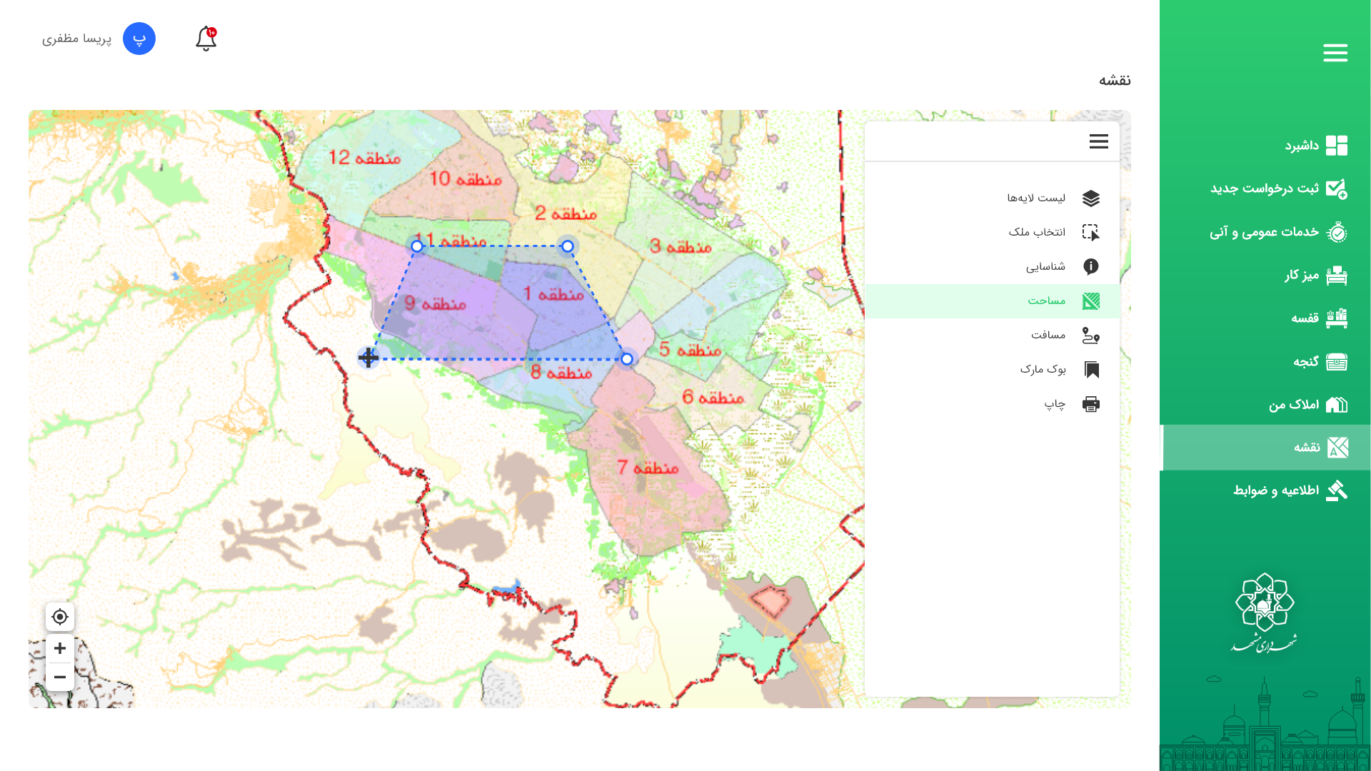
The existing city service portal was slow, hard to learn, and map-secondary. I led a redesign of request intake, triage, dispatch/inspection, and reporting with GIS at the center and full RTL/Jalali support.
The platform serves citizens and staff in one of Iran's largest cities. People mainly use it to pay bills and submit renovation requests. The old version had too many steps, inconsistent styles, and a lot of rework because people missed required information.
I led a redesign focused on simplifying the key journeys (payments, renovation), building a design system of shared styles and components, and making the platform more reliable for both users and developers.
Goals
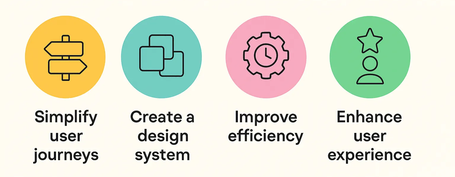
- Simplify user journeys, especially bill payments and renovation requests
- Create a design system so the whole site is consistent
- Improve efficiency, cut development time and reduce bugs
- Raise usability, higher task success, better SUS, fewer errors
Challenges
- Legacy systems: had to fit old databases and services
- Feature + journey redesign: add missing features and re-order steps logically
- Tight collaboration: coordinate design with developers and the product owner
Baseline
We checked the old screens, feedback, and usage: too many fields and steps caused drop-off; styles weren't consistent, buttons, spacing, and fonts changed page to page; validation happened late, so users submitted forms with missing info and had to redo them; the interface was hard to scan, with no clear progress and mixed patterns.
Research & Analysis
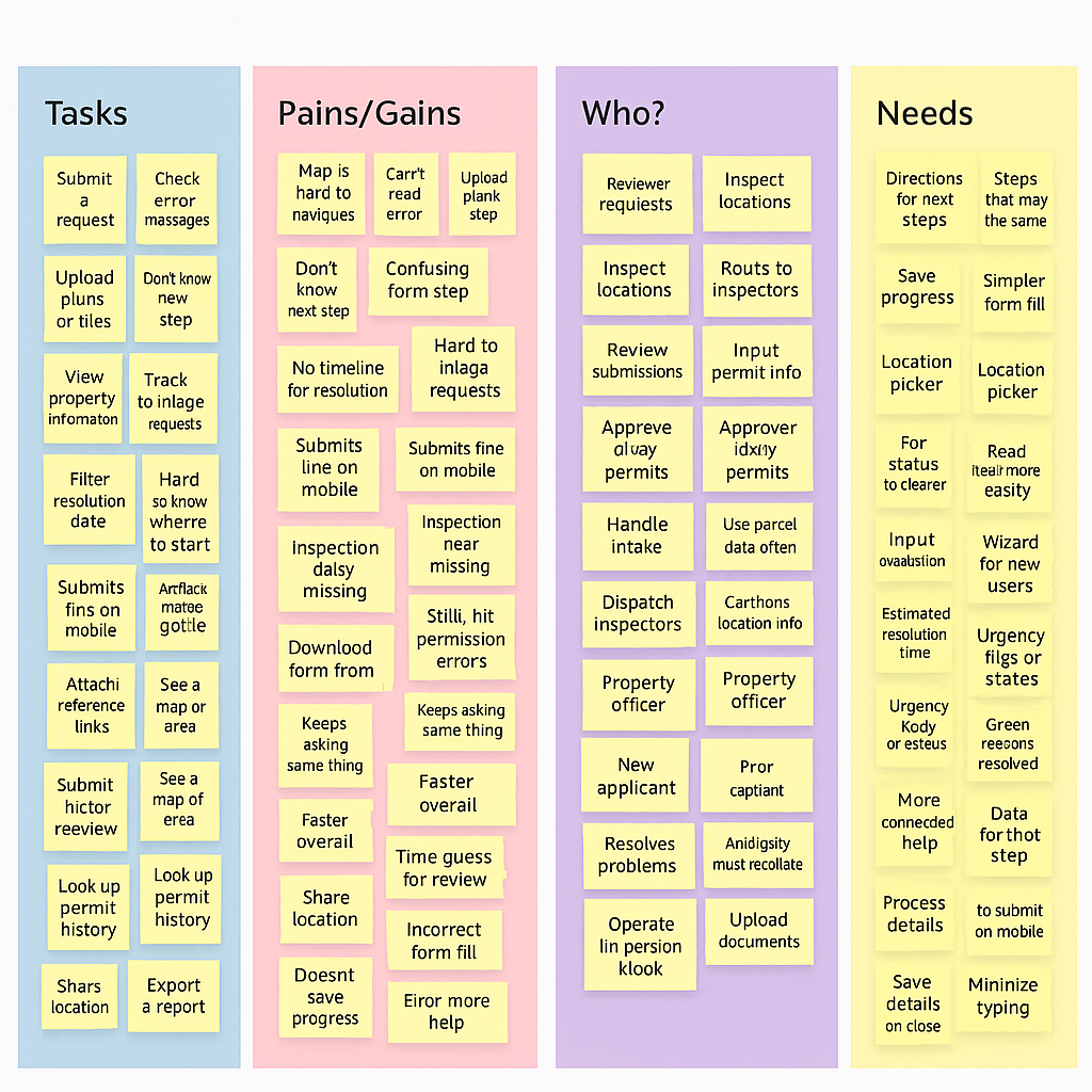
I looked at analytics and feedback from payments, debt payments, certificate renewals, and renovation requests; ran quick usability checks on the old flow to see where people got stuck; and spoke with the product owner and developers about technical limits.
Key insights: people want fewer steps and clear labels; errors should be shown early via live validation; progress should be visible, where I am and what's next; the whole platform should look and behave the same via a design system; RTL Persian must be correct everywhere, with Jalali dates where needed.
Strategy & Principles
- Speed to value: help people finish faster
- Familiar patterns: step-by-step flows, clear labels, simple forms
- Progressive complexity: basics first, advanced things when needed
- Prevent errors: live validation, helpful examples, required-field hints
- Consistency by system: one design system for all pages
- RTL & accessibility: correct right-to-left layout, readable contrast, keyboard friendly
Information Architecture
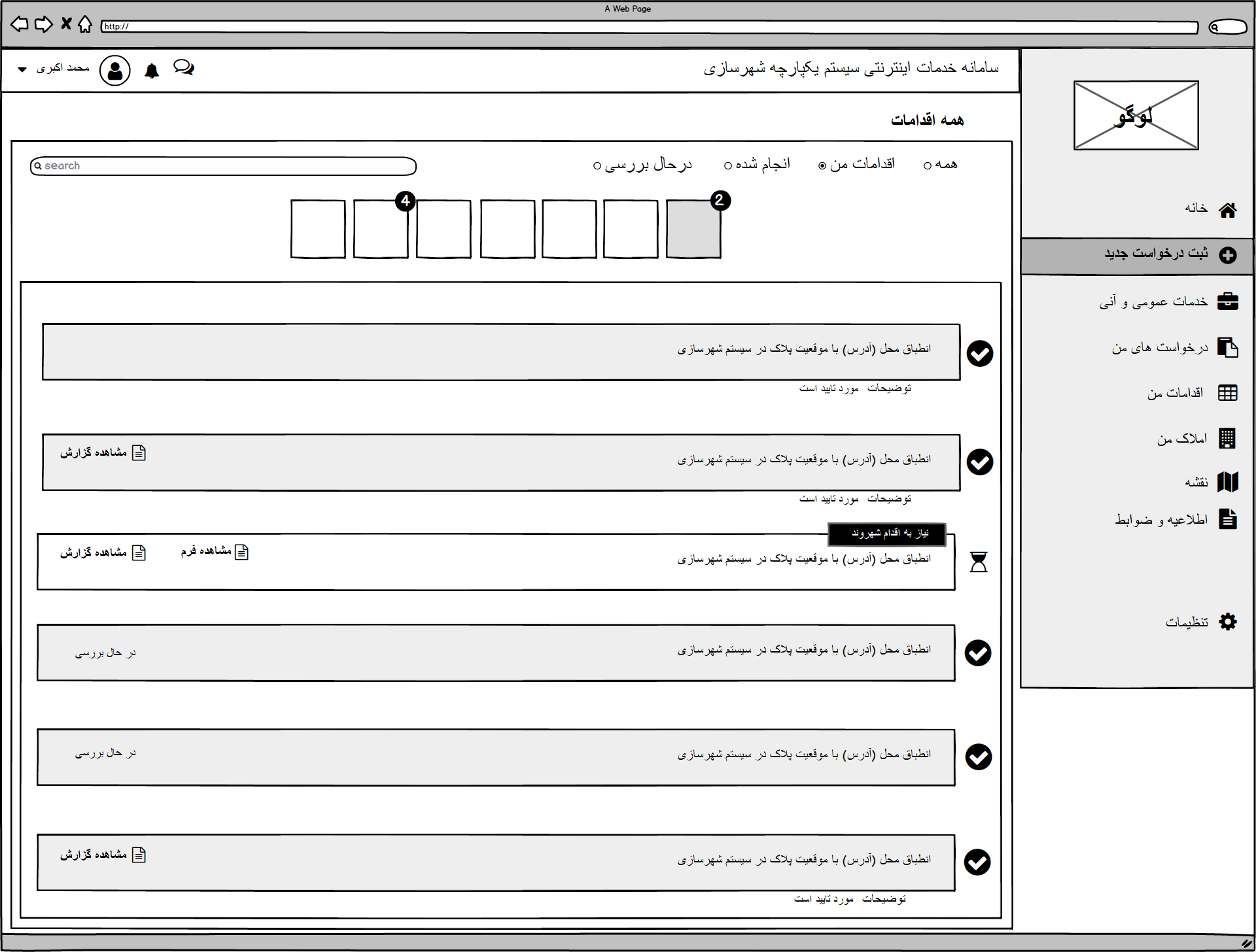
Before, many pages felt different and flows were long and confusing. After, clear sections and standard patterns: Payments as a step-by-step flow with a progress bar and a receipt at the end; Renovation requests with fields grouped by topic and examples under tricky inputs; My Requests to see status and history in one place; Help/FAQ for quick answers; and a simplified Profile for personal info and notifications.
Key Flows, Before → After
1) Bill Payments
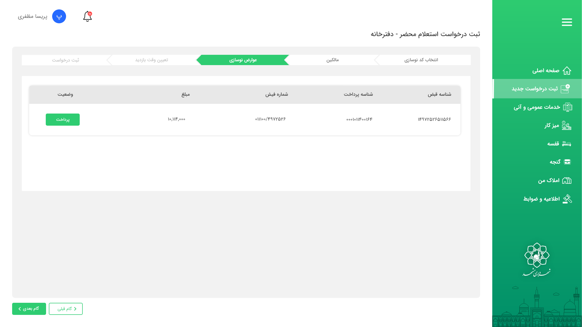
Before: a long form, unclear errors, no clear progress. After: guided steps, fewer fields per screen, live checks, a clear receipt. Result: median task time 3:30 → 2:00, task success 70% → 92%.
2) Renovation Requests
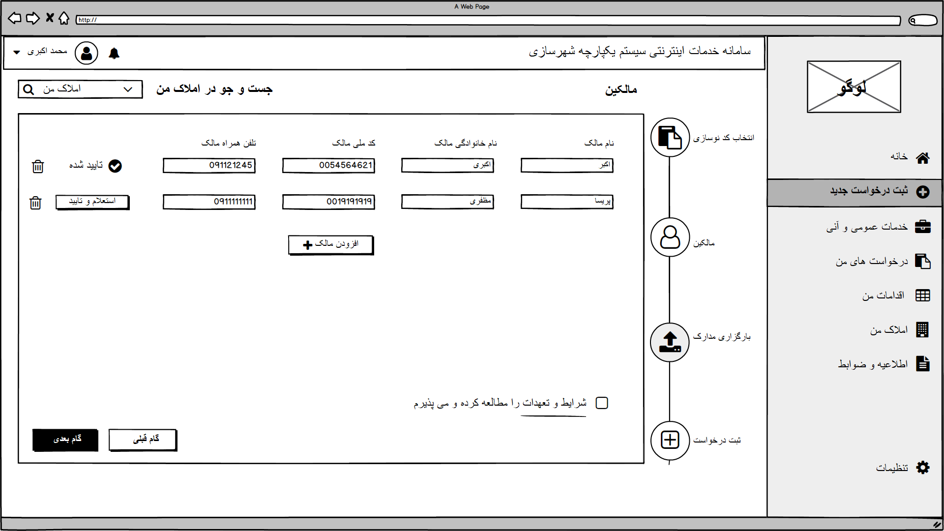
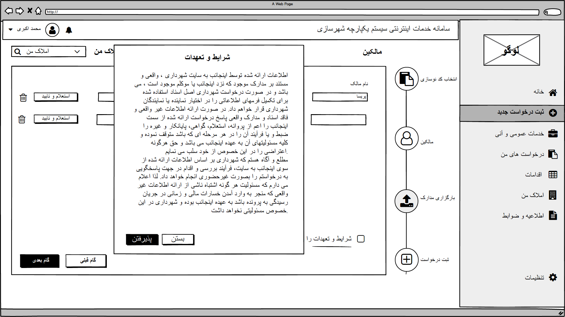
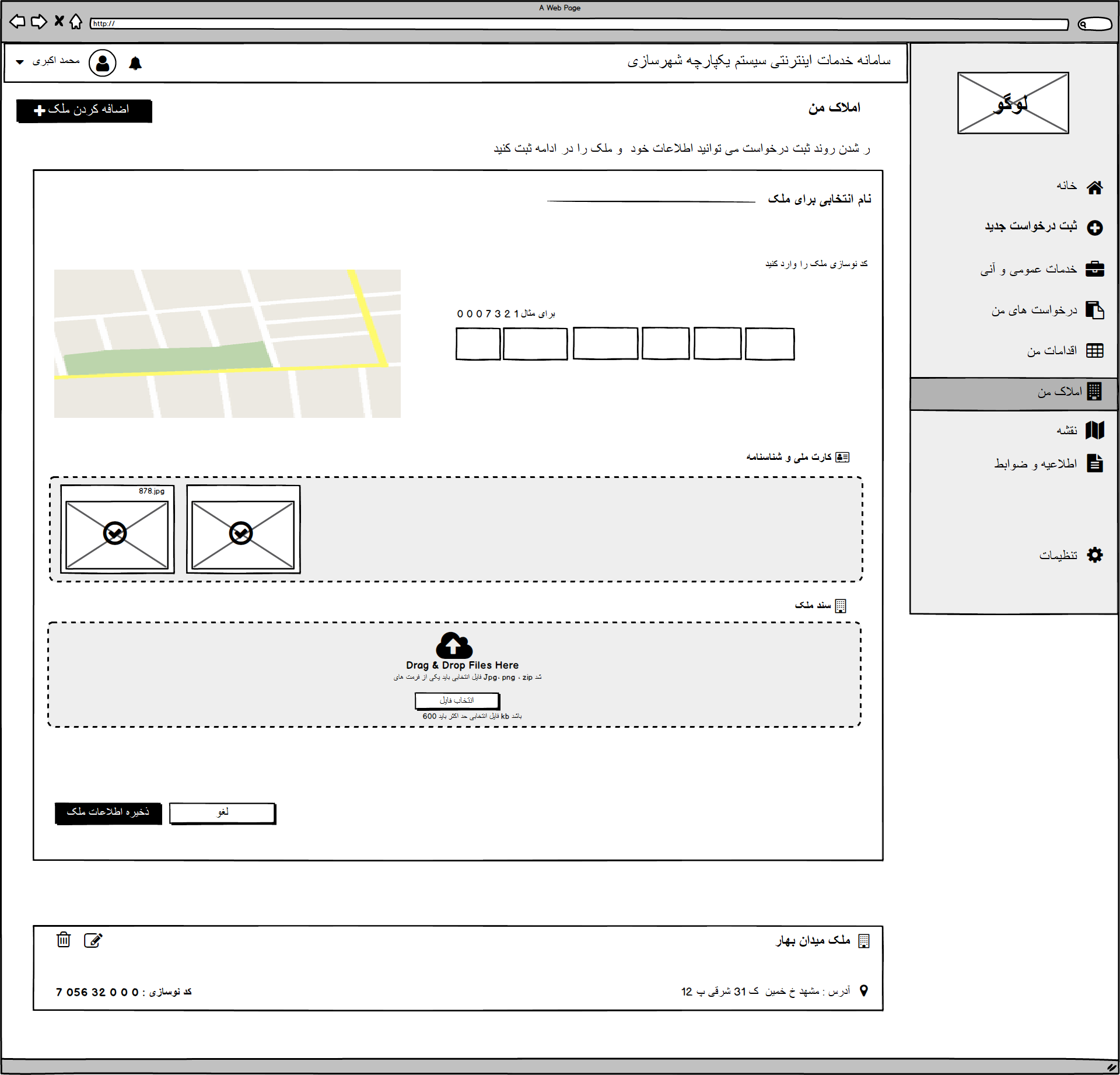
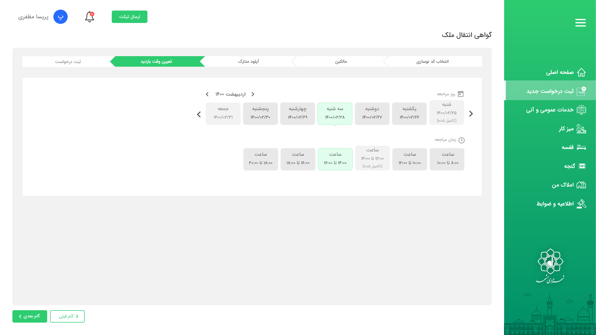
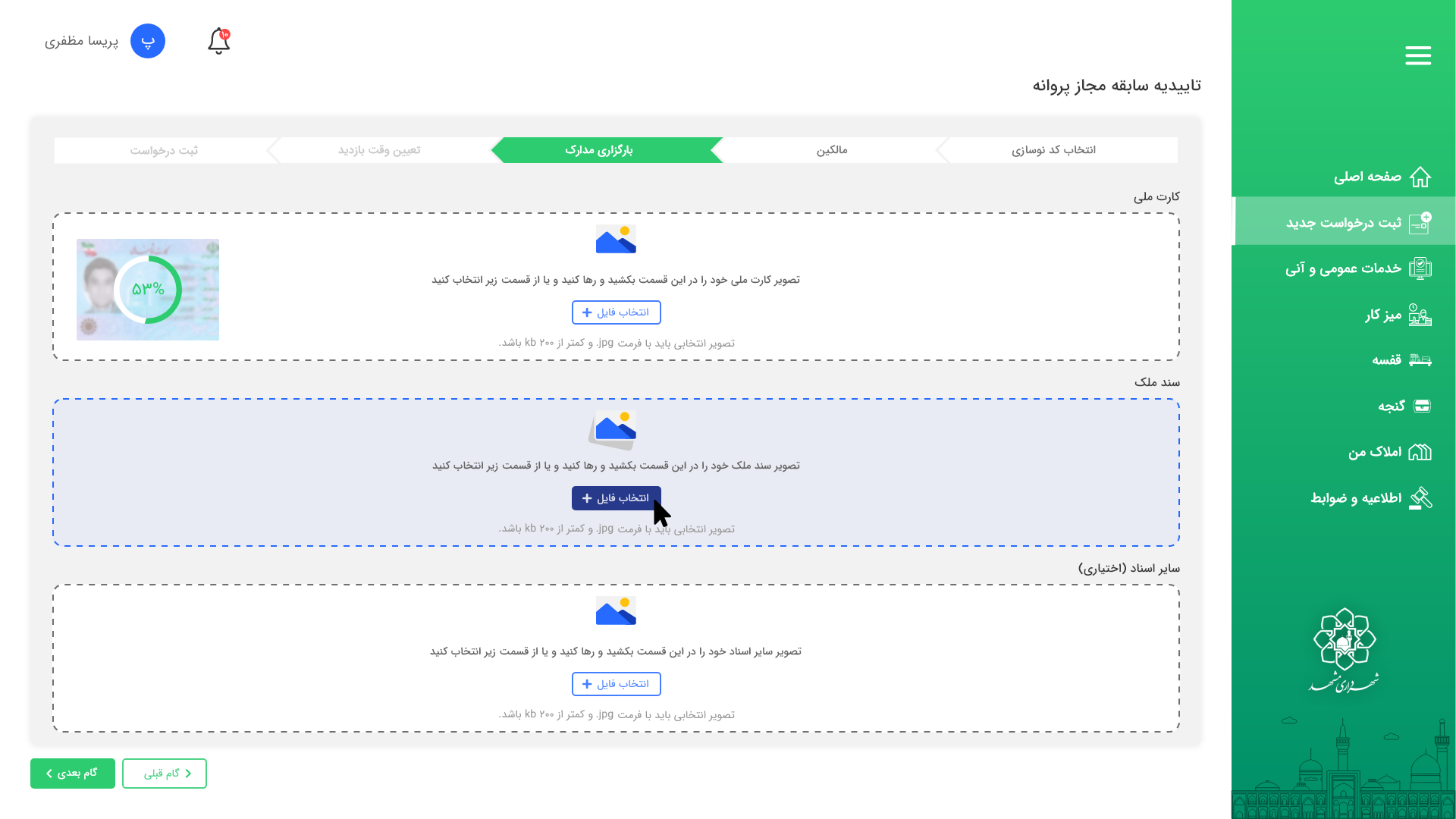
Before: 12 steps, confusing attachments, many returns for missing info. After: 7 steps, grouped fields, file upload with allowed types and size hints, a status tracker. Result: 12 → 7 steps, returns −30%, task success 66% → 88%.
Wireframes & Prototypes
Fast sketches to agree on structure, then clickable prototypes so the team could "try" new flows before coding. Three short rounds of usability tests watched users complete payments and requests, fixing issues and retesting each time.
Design System
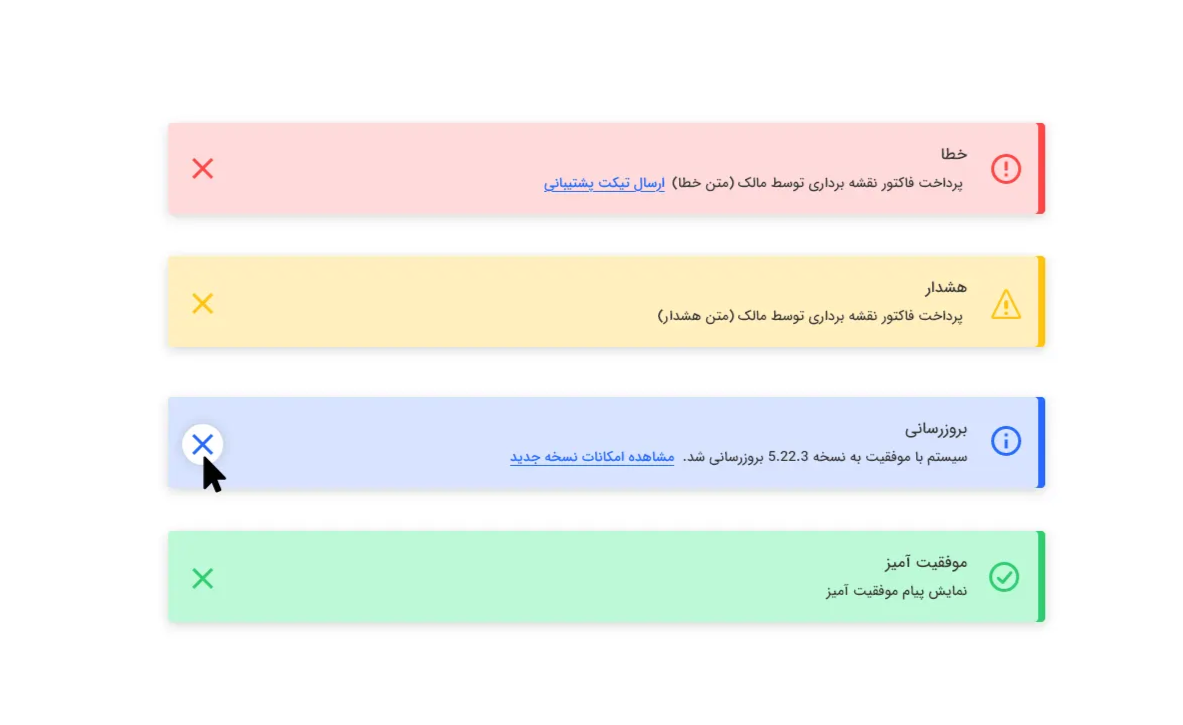
Tokens: colors, fonts, spacing, shadows. Components: buttons, inputs, selects, a Jalali/Gregorian date picker, file upload, notifications, tables. Guidelines: form labels, error messages, button order, spacing rules. RTL support: mirrored layouts and bidi-safe inputs that work correctly with Persian.
Why it mattered: reusing the same parts meant development ran 20% faster, and fewer one-off styles meant 16% fewer bug reports.
Testing & Validation
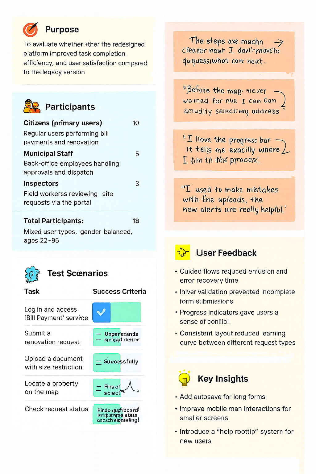
We tested paying a bill and downloading a receipt, submitting a renovation request with files, tracking request status, and editing profile basics.
What improved: task success 68% → 90%; fewer missing-field errors thanks to live validation; SUS 62 → 82; support tickets on common "how do I…" questions down 18%.
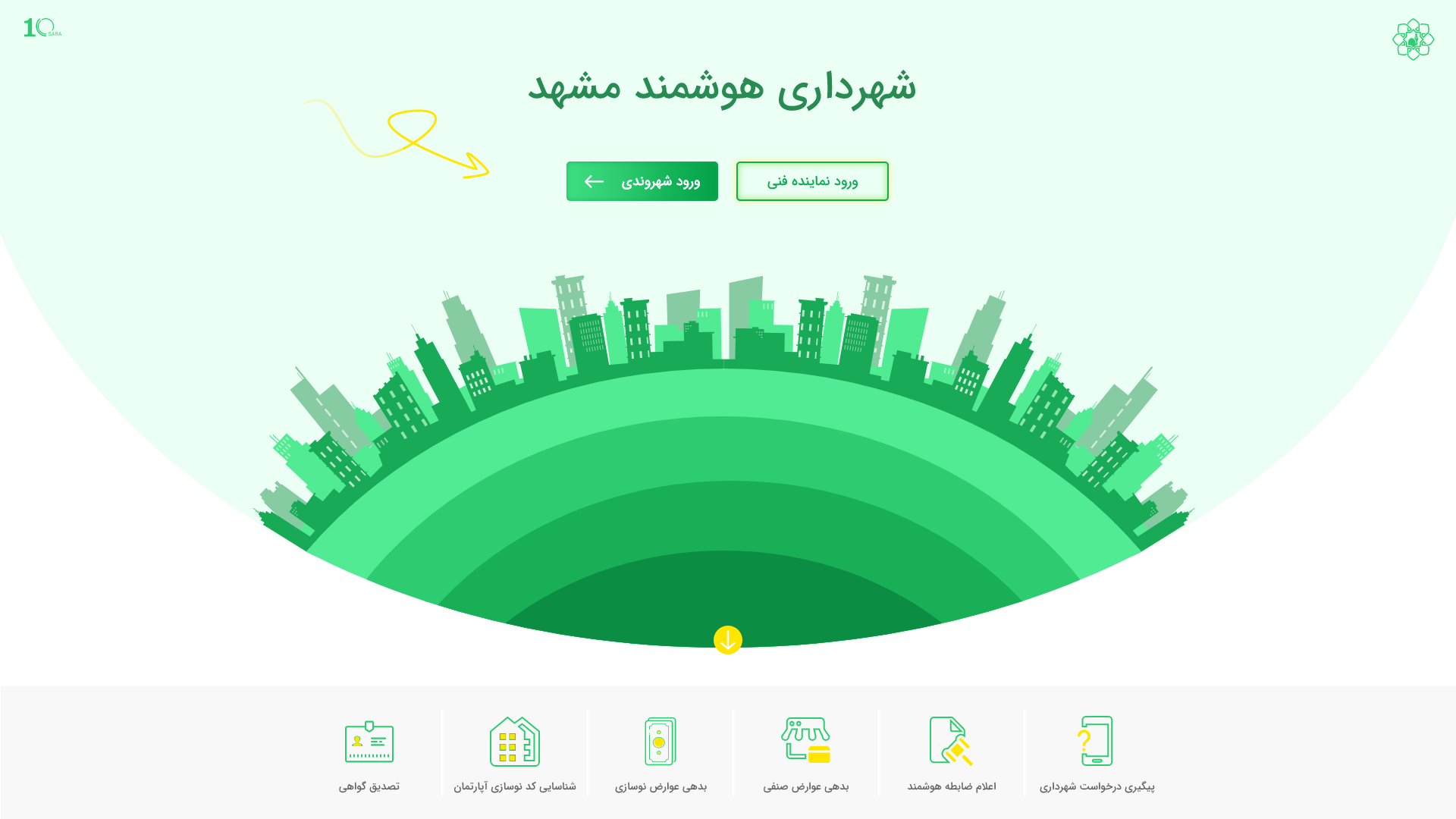
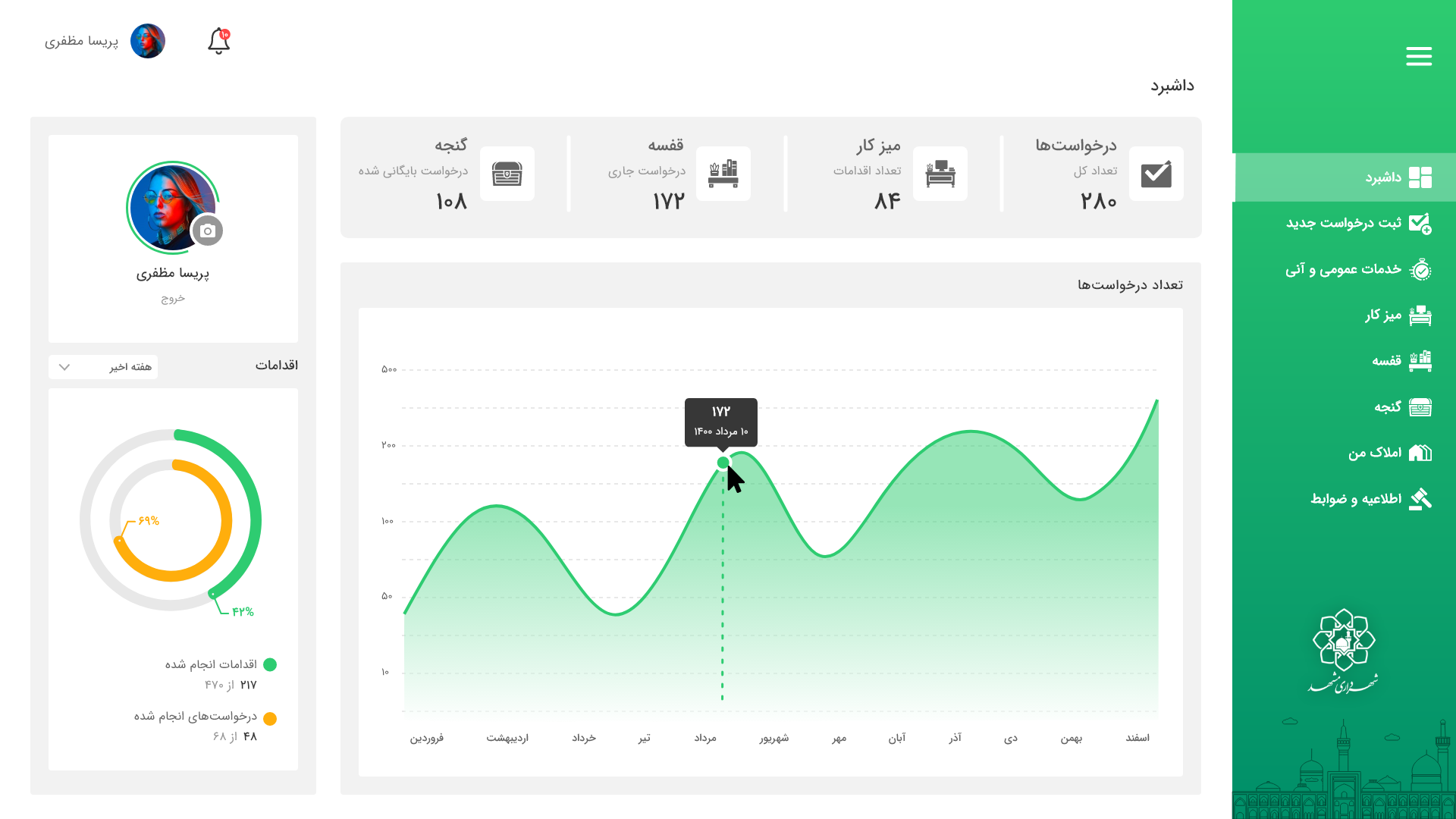
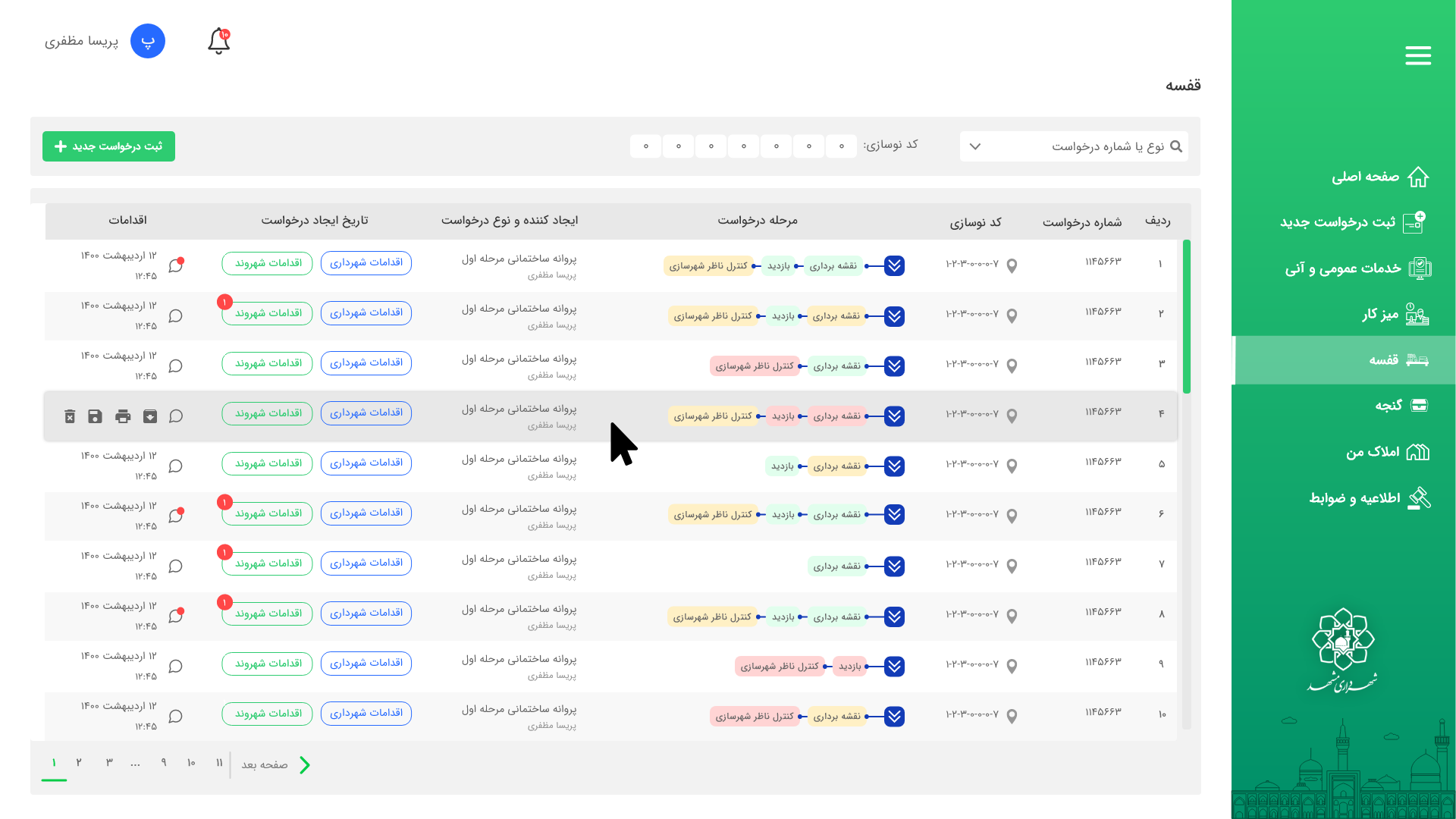
Screens
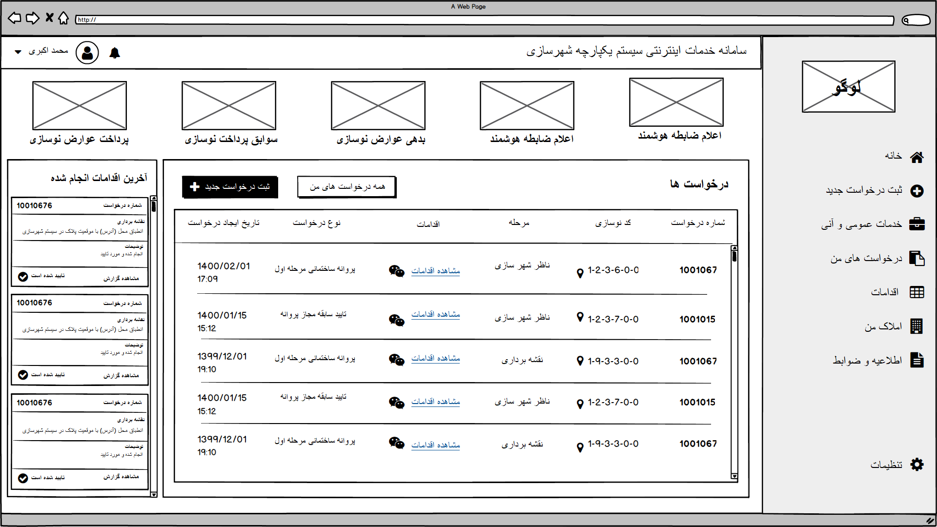
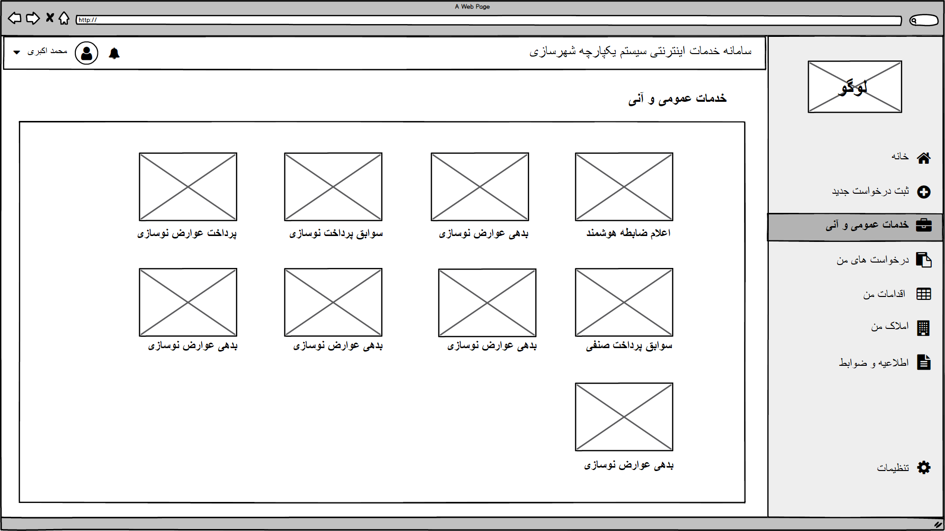
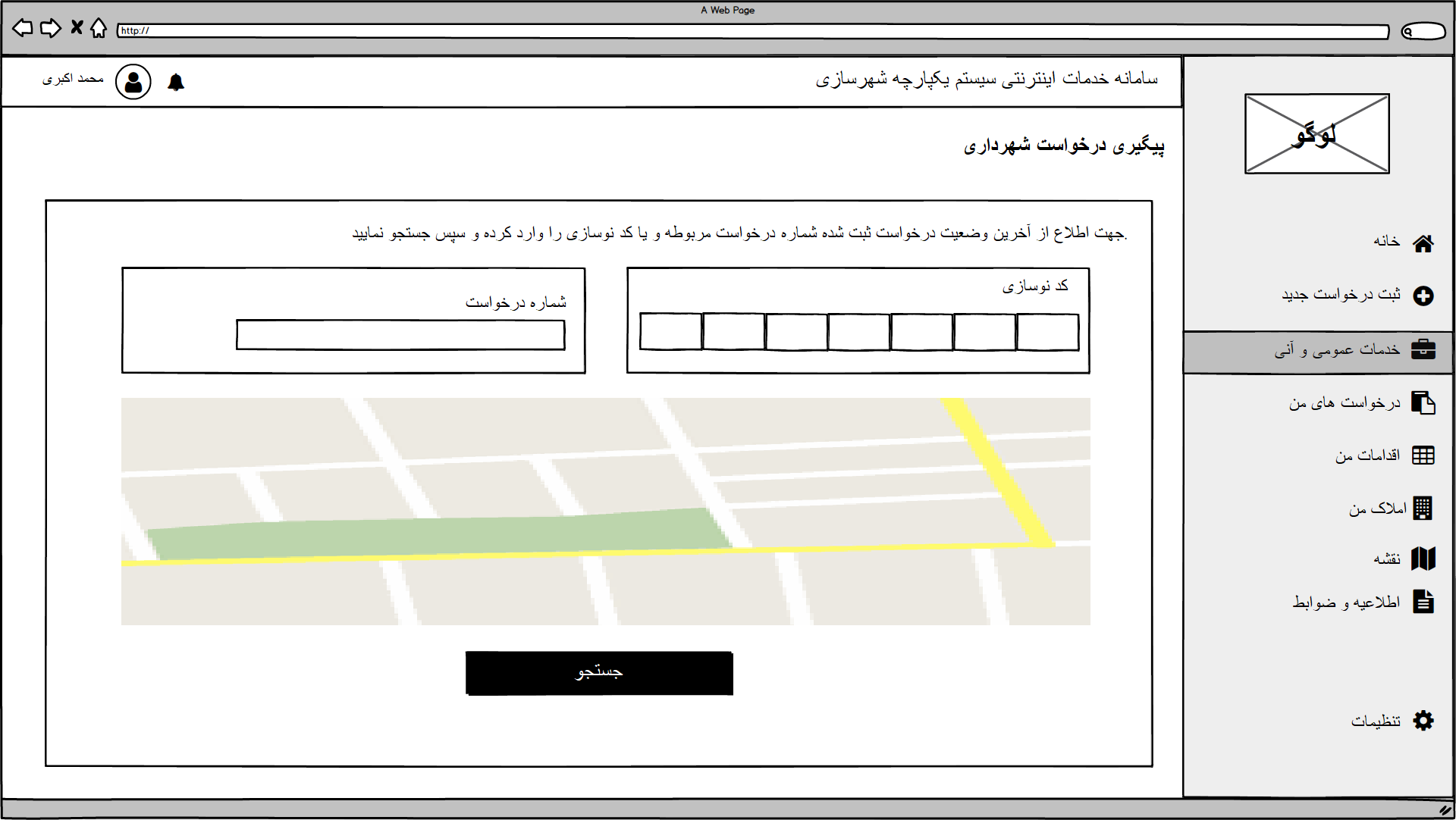
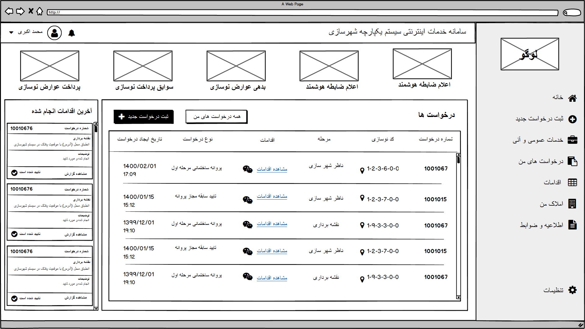
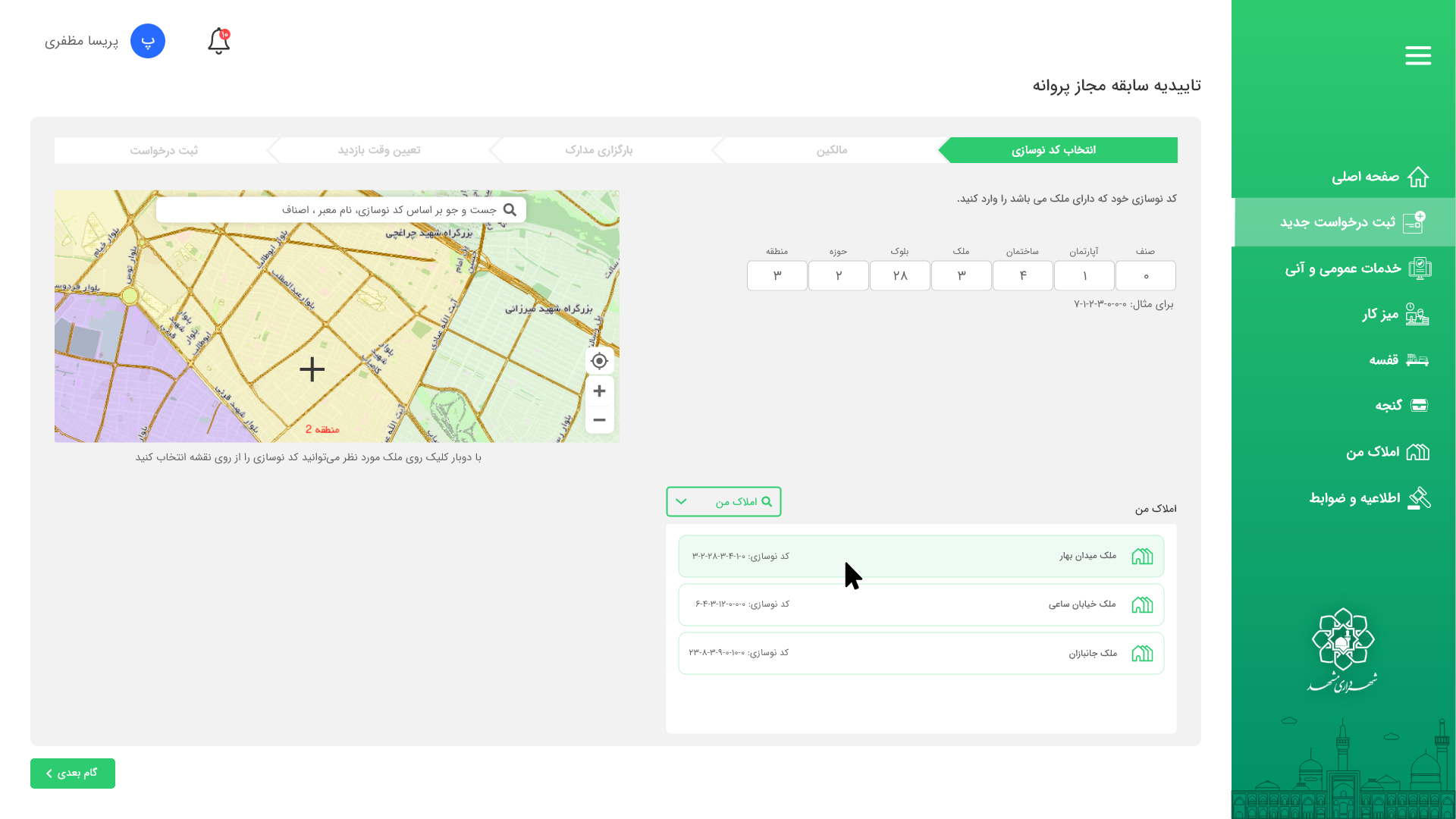
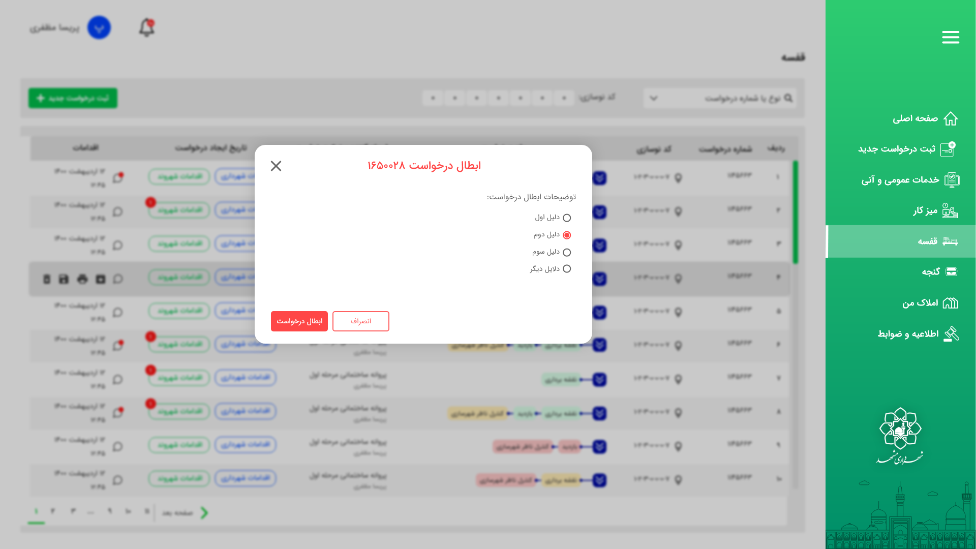
Results
- Development time down 20%
- Bug reports down 16%
- Bill payments: 3:30 → 2:00
- Renovation requests: 12 → 7 steps, returns −30%
- Task success: 68% → 90%
- SUS: 62 → 82
What users said: "It's clear what to do next." "I like that it tells me the problem right away before I move on." "Everything looks consistent now."
Insight → Design Decision → Outcome
| Insight | Design decision | Outcome |
|---|---|---|
| People submit with missing info | Live validation + examples | Returns −30% |
| Too many steps | Step-by-step flows + grouping | 12 → 7 steps |
| Hard to scan | Progress bar + short screens | Faster time (payments 3:30 → 2:00) |
| Inconsistent UI | Design system + component library | Dev time −20%, bugs −16% |
| RTL issues | Mirrored layouts + Jalali date picker | Fewer layout bugs & support calls (−18%) |
Collaboration
Weekly check-ins with developers to make sure designs were buildable; prioritized with the product owner so we shipped the most valuable parts first; handoff with clear specs, states, and reusable components.
Rollout & Risk Management
A pilot release ran the new flows while old ones still worked. Three short training videos for staff and a "what changed" page for citizens eased the transition. We tracked metrics for four weeks and fixed issues quickly.
Risks & mitigations: legacy data mismatch, handled with field mapping and safer defaults; browser and device differences, handled by testing on the most common browsers and phones; accessibility, addressed with color contrast, keyboard navigation, and focus outlines.
My Responsibilities
- Led the redesign of payments & renovation flows
- Built the design system and component library
- Created wireframes & prototypes in Adobe XD
- Ran user tests, gathered feedback, made changes
- Worked closely with developers and the product owner
- Prepared handoff docs and helped during rollout
Takeaways
This project reinforced the value of clarity, consistency, and collaboration in complex digital systems. A well-structured flow and reusable design system make the experience easier for users while helping teams work faster and with more confidence. Small details, like clearer steps and smarter validation, can build trust with both users and developers. The project also strengthened my ability to balance user needs with technical realities and make decisions based on measurable results.