FlexTrip, Compare Flexible Trip Dates and Vote as a Group
Compare honestly. Decide together. No tool combines flexible-date price comparison across hotels with fair group voting, FlexTrip closes that gap.
I was brought on as a freelance Product & UX Designer by the solo founder of an early-stage travel startup, based in the Netherlands. The engagement was a solo contract with weekly founder reviews, the design decisions were mine to make and defend. I used Claude Code to help build the prototype, so the execution was AI-assisted, not handed off.
The three hardest design decisions in this project
- Showing users that the price changed after they started browsing, and making that feel honest instead of deceptive.
- Replacing score-based voting with ranked choice, a fairer system most people have never used.
- Building a two-entry-point product: the organizer's research journey and the voter's zero-context link.
At a glance
- The gap: price tools ignore groups and group tools ignore prices. Nobody combines flexible-date price comparison with fair group voting.
- What I designed: a coded, interactive prototype for a two-sided flow, where the organizer researches and shares and the group votes blind, plus a ready-to-run usability-test kit.
- Signature decisions: honest cached-vs-live pricing, blind ranked-choice voting, and a zero-context voter link.
- How it ships: as a standalone consumer app and as an embeddable "decide-together" layer other travel platforms can drop in.
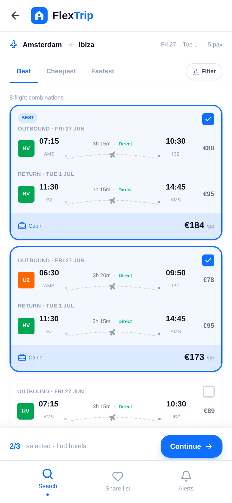
The Brief
The idea wasn't mine. The client came to me with a story and a spreadsheet.
The summer before, she'd planned an Ibiza trip with four friends. Their dates were flexible, any combination within a two-week window, and that should have been an advantage. Instead it turned planning into a nightmare, because every shift in dates changed every price. She opened dozens of tabs (Booking.com, Sunweb, D-reizen, Skyscanner) and built a 14-row spreadsheet by hand: dates, flight cost, hotel cost, tour cost, total per person, and notes like "8.4 on Booking, breakfast €18, adults only." It cost her about three hours.
Then the group vote. Everyone scored each option 1–10 in the shared sheet; highest average wins. The moment scores were visible, friends started lobbying. People changed ratings after seeing others'. The loudest voice won, not the best option.
She was convinced there was a product in this. My job was to pressure-test that conviction, and if it held, to design the product around it. We agreed on a scope: validate the gap, define the experience, and deliver a working prototype she could put in front of users and investors.
Research & Discovery
Competitive audit
First question for any client brief born from personal frustration: has someone already solved this? I audited 11 platforms. The seven that mattered:
| Platform | What it does well | What's missing |
|---|---|---|
| Google Flights | Date-flexibility matrix for flights | No hotels, no total cost per combo |
| Booking.com | Hotel comparison, flight+hotel bundles | One search at a time, no date matrix, no group features |
| Sunweb / D-reizen | Tour packages (popular in NL) | No comparison against booking separately |
| Troupe | Group polls for trip decisions | No price data, assumes you've already decided |
| Skyscanner | Month view for cheap flights | No hotels, no group coordination |
| Expedia | Flight+hotel bundle pricing | One search at a time, no voting |
The remaining four (Prijsvrij, Plan Harmony, Wanderlog, Priceline) confirmed the same pattern.
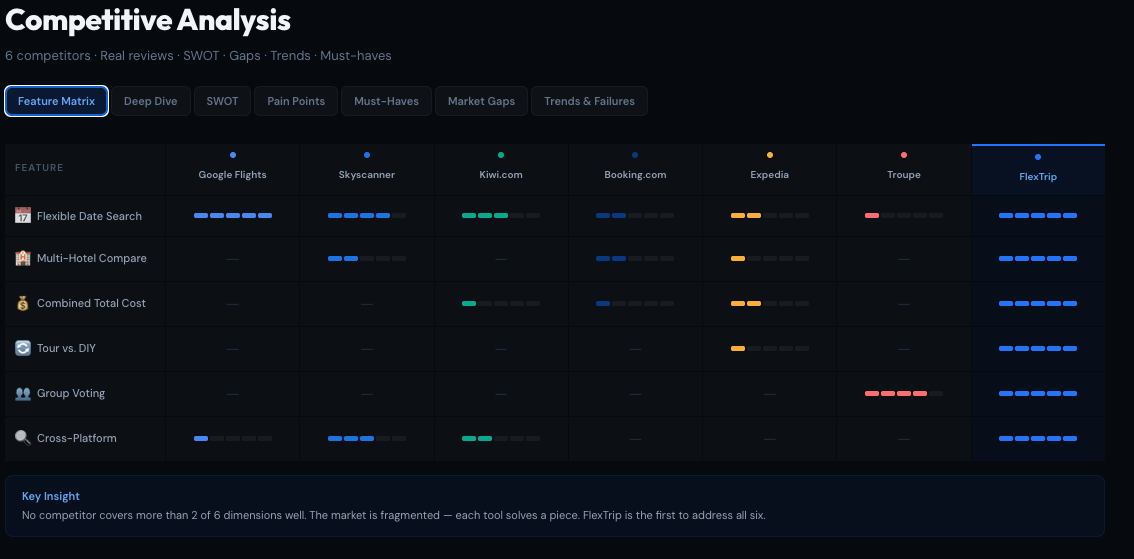
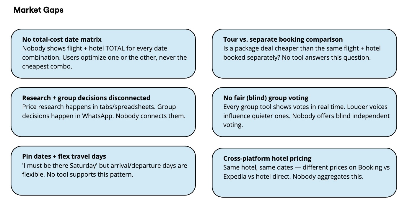
Price tools ignore groups, group tools ignore prices. The client's hunch held up.
Survey
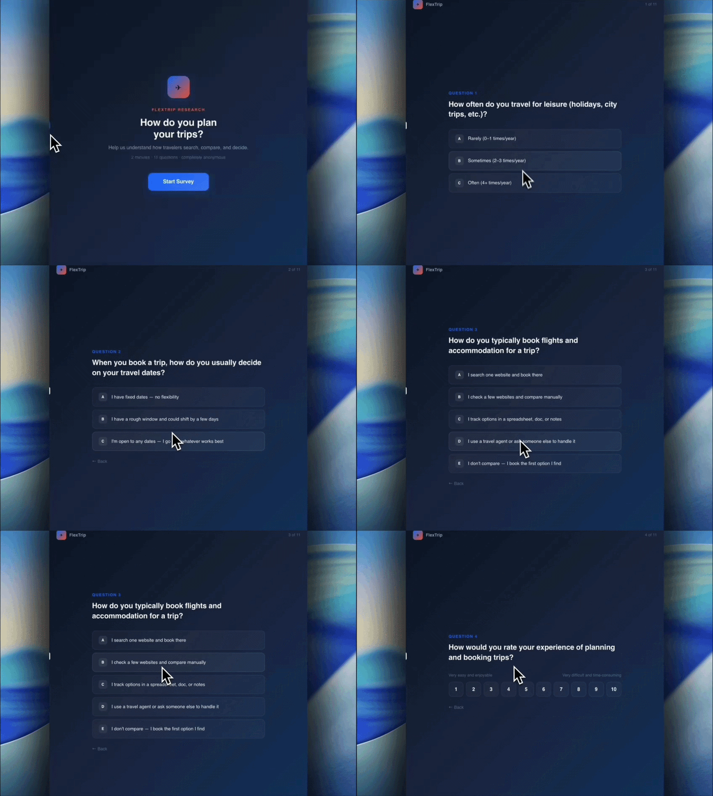
To check the pain wasn't unique to one bad Ibiza trip, I built an 11-question survey with conditional logic, group-trip questions stayed hidden from people who'd never planned one, so hypothetical answers wouldn't pollute the data. I built it as a small React app rather than a Google Form, with one question per screen, a progress bar, and brand styling. I piloted it with the client's network and my own (n=14). That's directional, not statistically significant, and I presented it to the client as exactly that.
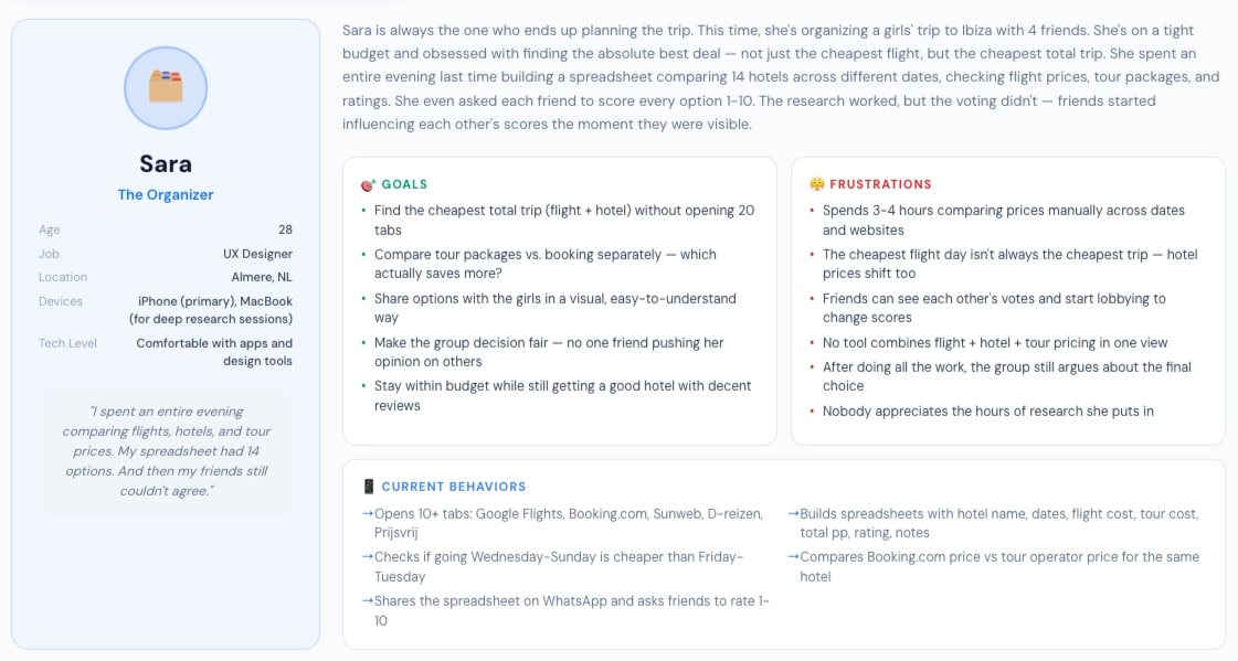
What the pilot confirmed:
- Comparing prices across dates and hotels was the top time sink, ahead of destination selection
- Most respondents compared across 2–3 sites manually; several kept spreadsheets
- Group decision satisfaction skewed negative, with "one person researches and decides" the dominant pattern
- In the feature-ranking question, "seeing total costs for different date combinations" ranked first, with "sharing options with travel companions to decide together" close behind
These two findings became the two design bets. The total-cost-across-dates result drove the combo-first architecture, and the decide-together result made blind group voting the core differentiator rather than a feature bolted on later.
Personas
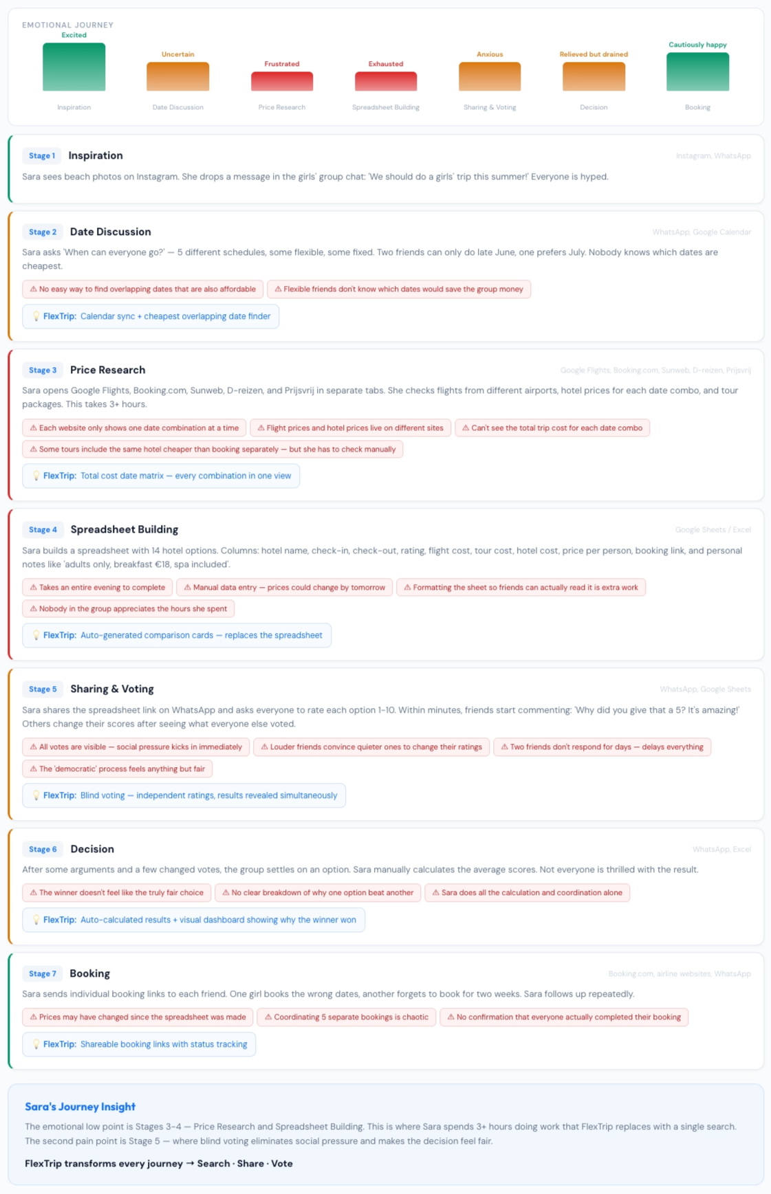
Two personas drive the product's two flows. A third (the solo flexible traveler) informed the date-matrix design but isn't central to the group-decision differentiator.
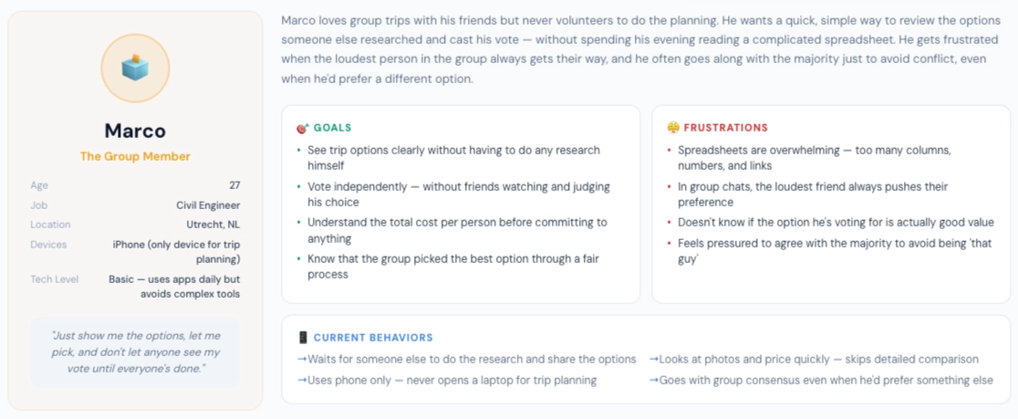
Sara, the Organizer. 28, Almere. Organizes 2 to 3 group trips a year and spends hours building comparison spreadsheets. Frustrated that friends don't engage with the research but still complain about the choice. Her goal: present clear options and get a fair answer back.
Marco, the Group Member. 27, Utrecht, civil engineer. Joins trips other people organize and gets sent screenshots and WhatsApp polls. Votes with the majority to avoid conflict and doesn't fully trust the process. His goal: have a genuine say without doing the research.
Personas are composites; quotes are illustrative, synthesized from survey open-text responses and the client's own experience organizing group trips.
Architecture & Wireframes
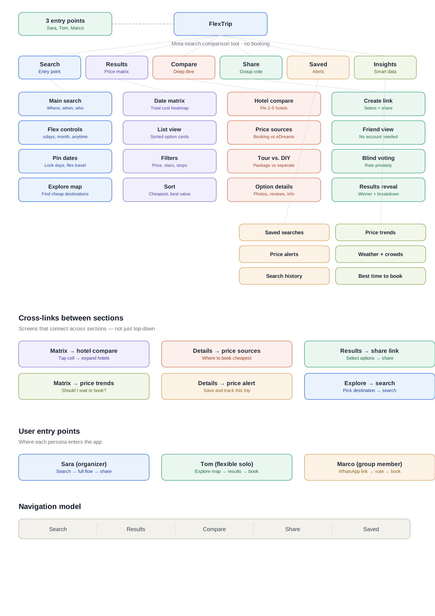
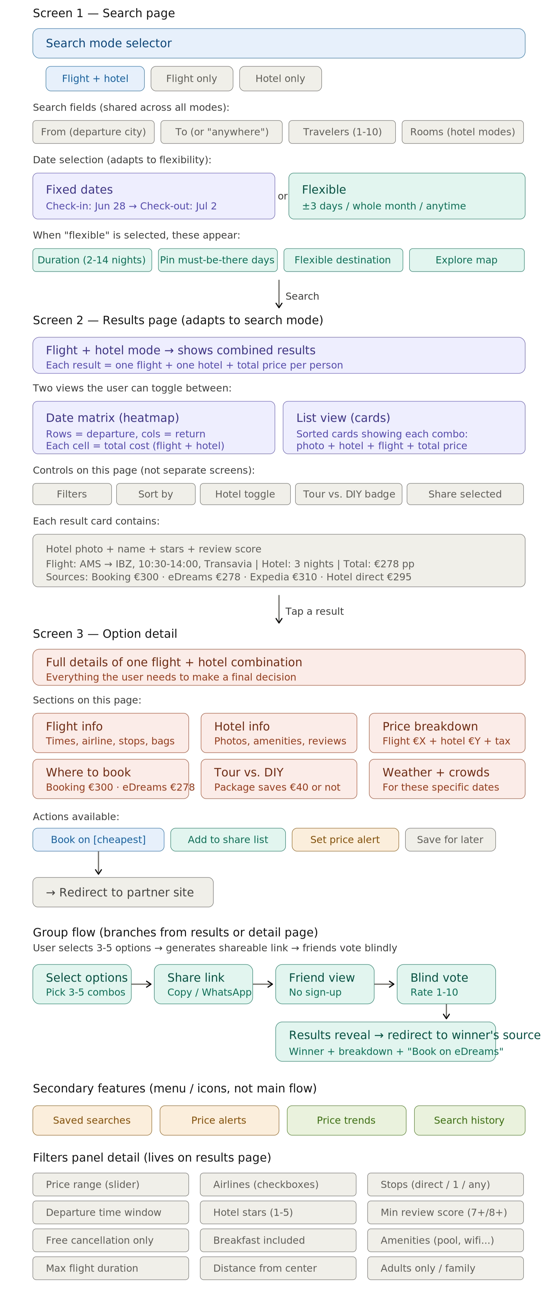
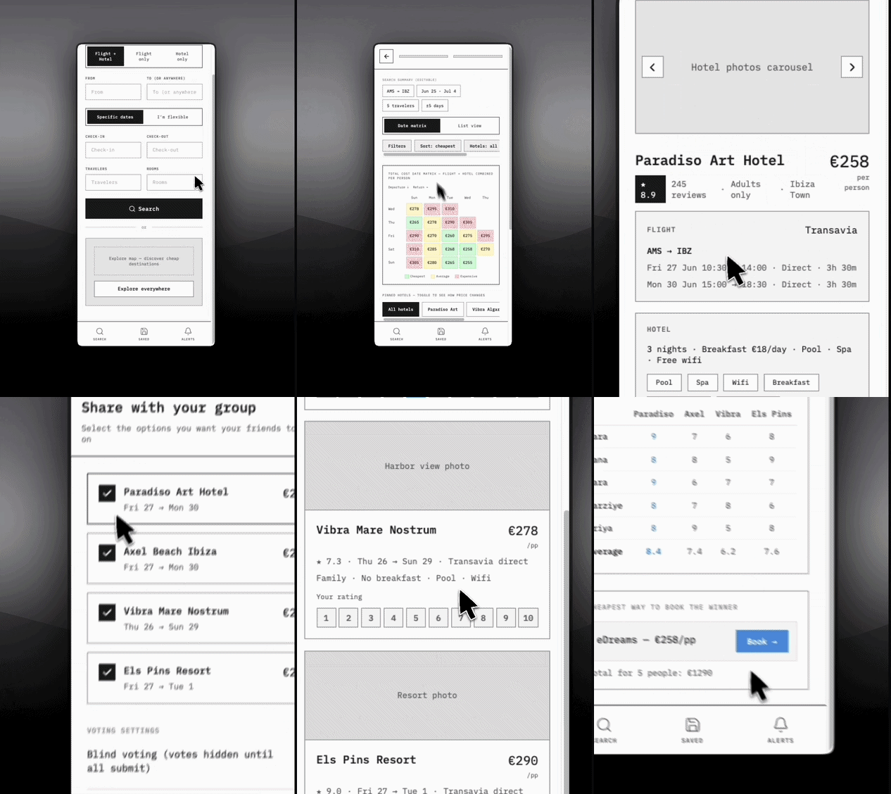
I mapped the full product as 6 sections and 22 screens, then wireframed the core flow of 9 screens, where two journeys converge at a shared decision point:
- Organizer: Search → Flight combos → Hotel comparison → Save to share list → Configure voting → Share link → Wait → Results
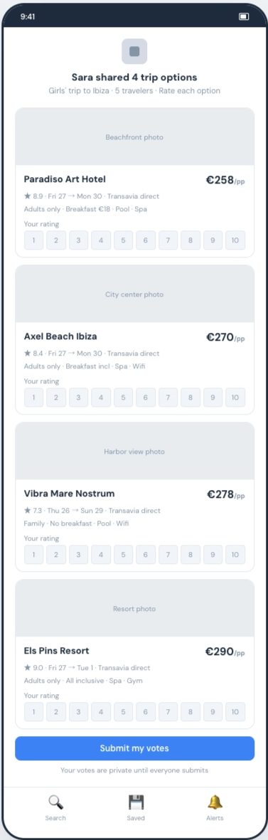
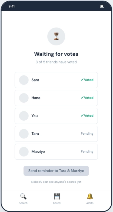
- Voter: Open link (cold) → View options → Rank → Submit → Results
Key structural decisions:
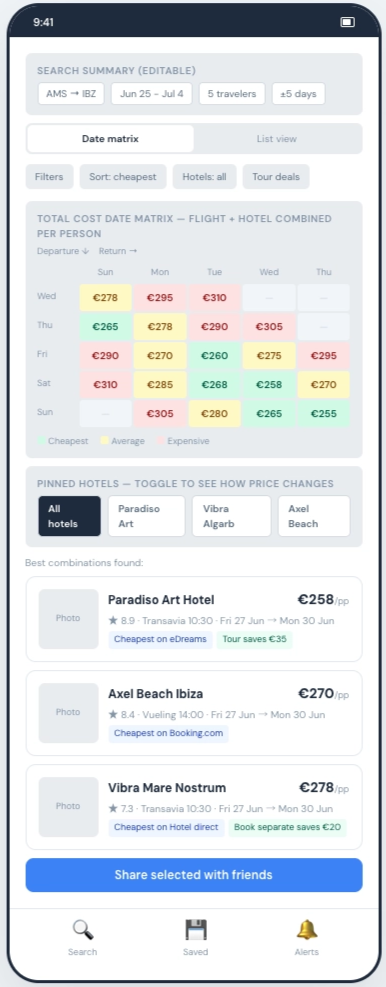
- Combo-first architecture. Users select flight date combinations first, then see hotels for those dates, inverting the typical destination → dates → results flow to foreground the flexible-date value.
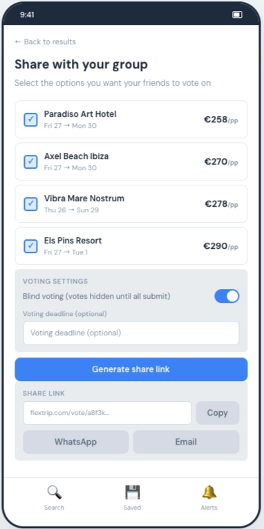
- Share list as staging area. The organizer curates which hotels the group sees, giving Sara control and Marco a clean slate.
- Separate entry points. The voter flow has its own URL and layout. No login, no onboarding, no awareness of the organizer's journey required.
- Meta-search, not booking. FlexTrip finds the best combination and hands the booking off to Booking.com, eDreams, or Expedia. No payments in the app, a scoping decision that simplified everything downstream.
Wireframes were reviewed with the client via a walkthrough video before moving to the prototype. Click any image below to view it full size.
Interactive Prototype
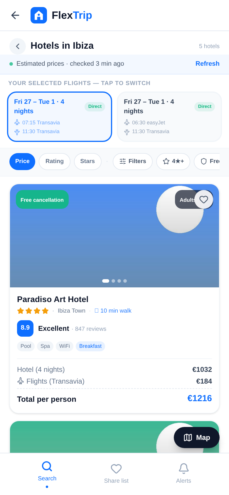
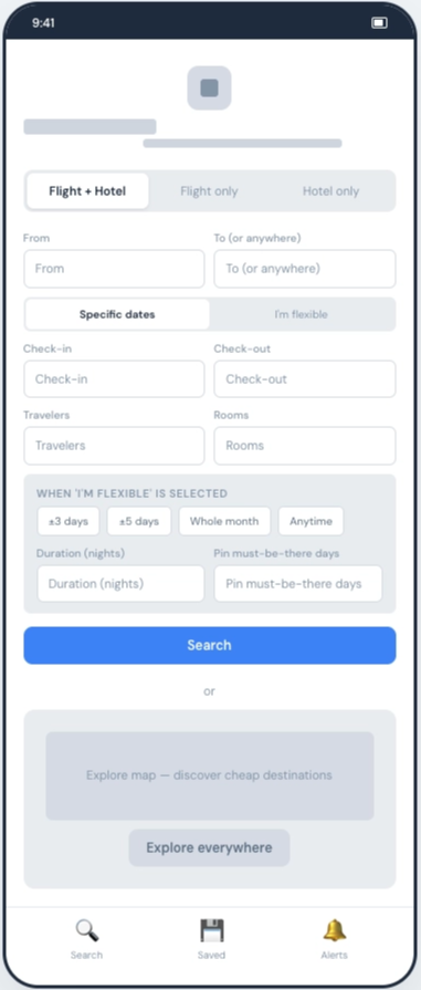
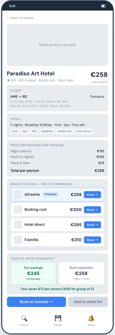
Built in React (Vite + Tailwind CSS + Framer Motion) rather than Figma, because the core interactions require real state: the share list persists across screens, the voting flow tracks ranked/unranked/submitted states, and sticky elements need real scroll behavior. Sample data used realistic totals (€258–€310 per person across the date matrix) so price comprehension could be tested honestly.
The Design Review
Before testing, I reviewed the prototype against product-level criteria and walked the client through what I found. Five structural issues surfaced, not polish, but the kind of thing that changes whole screens. This turned out to be the most substantial design work in the project.
Pricing honesty: designing the failure case
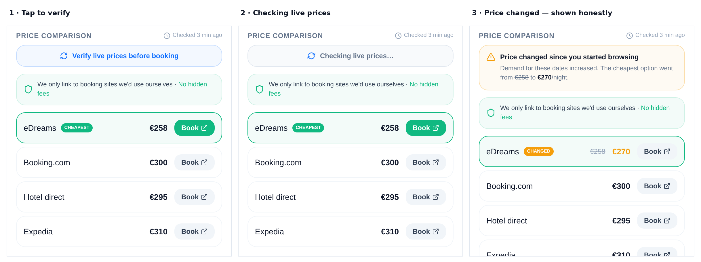
The problem. The comparison screen shows prices, but pulling live prices for a full date matrix isn't feasible at scale, so these are cached estimates. Showing them without context implies they're live. The moment a user discovers at checkout that the price changed, trust is gone, and trust was the product's whole pitch.
The fix. A two-tier pricing model:
- Comparison views show a freshness banner: "Estimated prices · checked 3 min ago" with a pulsing status dot
- Hotel detail adds a "Verify live prices before booking" button with three explicit states
The changed state is the part of this project I care about most. Competitors quietly show a different number at checkout, and the user feels tricked. FlexTrip shows the old price struck through, the new price, and a one-line reason it changed. I built this path on purpose, it's the moment that either earns trust or loses it. Designing only for the happy path would have made a good demo and a dishonest product.
Voting fairness: from scores to ranked choice
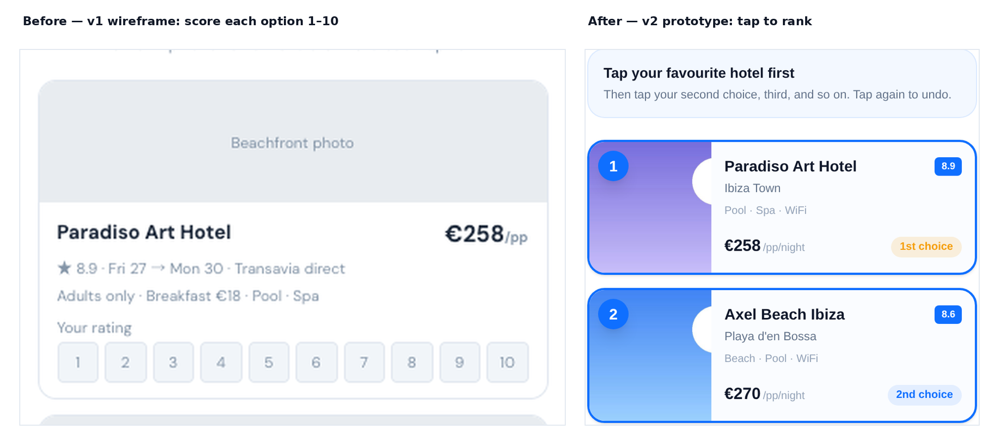
The problem. My first design just reproduced the client's spreadsheet: score each option from 1 to 10. But a score means something different to everyone, one person's 7 is another person's 4, and the organizer picks which options make the list in the first place, so the biggest influence lever is invisible.
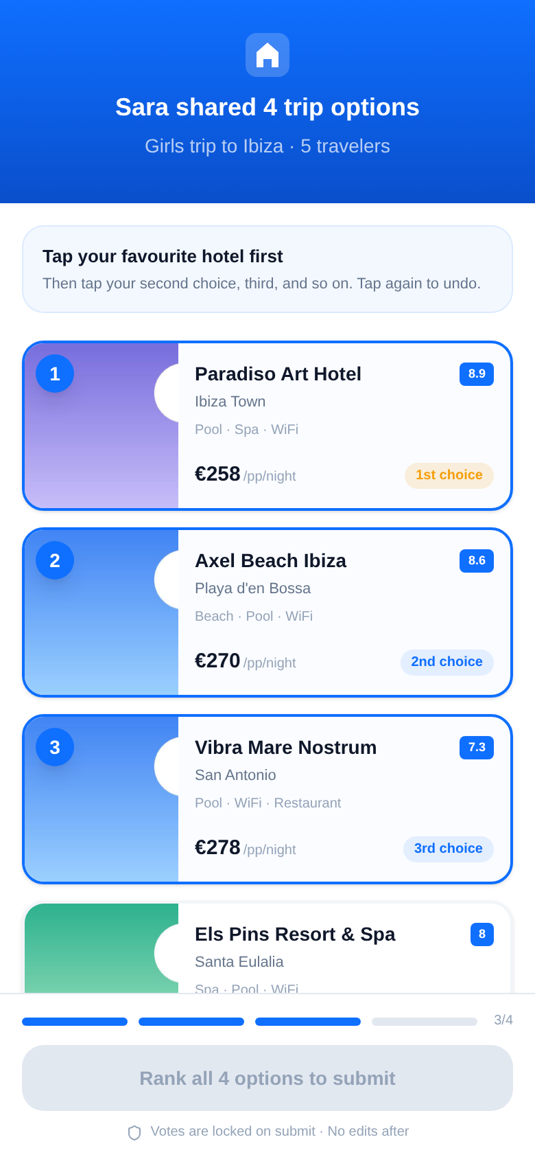
The fix. Ranked-choice voting: everyone ranks all options by tapping in order of preference. Lowest average rank wins. Two fairness mechanisms on top:
- Blind until complete. No one sees anyone else's ranking until all votes are in, no anchoring, no lobbying.
- Wildcard suggestion. Each group member can optionally add one anonymous option before voting opens, reducing organizer curation bias.
Three more structural fixes
Voting time gap. Options are perishable inventory, and days pass between sharing and voting. Fix: a configurable deadline (24h/48h/72h), with dead options shown transparently in results as "No longer available, next choice counted."
Journey closure. The original flow ended at the results reveal, so nobody actually knew if the trip was happening. Fix: a "Mark as booked" button that triggers a celebration and notifies everyone who voted, and a "Plan your own trip" CTA at that high point turns voters into organizers, the client's viral loop.
Trust artifacts. "We're honest" is a value, not UI. Fix: a shield-badged trust banner above booking sources ("We only link to booking sites we'd use ourselves · No hidden fees") and a tappable "How this works" explainer on ranking results.
Pilot: Simulated Walkthrough
Moderated usability test with a think-aloud protocol. Remote or in-person, on the clickable React prototype, 30–45 minutes per session, 10 sessions total (5 organizers and 5 voters). Two or three are paired sessions, where one participant shares a live prototype link over WhatsApp and their actual friend opens it cold on their own phone, the most realistic test I could design for the zero-context voter flow.
Three study goals: (1) Is the organizer flow discoverable and completable without instruction? (2) Does the voter flow work with zero context, on a link received cold? (3) Trust, do users believe the prices, and does the price-changed state feel honest or deceptive?
Participants: organizers who planned a 3+ person group trip in the last 12 months and did the research themselves; voters who participated in someone else's trip. Ages 20–55, deliberately including 1–2 low-tech participants. UX designers and tech-product people excluded; recruited friends-of-friends, one step removed, to avoid politeness bias. €15 incentive regardless of completion.
Five tasks, each with success criteria and metrics:
- Organizer end-to-end. "You and 4 friends want a beach trip in late June, around €300 each, dates are flexible. Find the best-value option and get your friends' opinions." Success: completes search, flights, hotel comparison, and shares with 2+ hotels in under 8 minutes with no moderator help.
- Comprehension probe (mid-task). "What do you think this screen is telling you? What does this price include?", measures whether the number reads as hotel-only or hotel-plus-flight.
- Voter cold link. A link sent over WhatsApp with no context: "Your friend just sent you this. Do whatever you'd naturally do." Success: understands the ranking, submits within 4 minutes, never asks "what do I do?"
- Trust probe. "Would you actually click through and book this? Why or why not?", listening for trust versus skepticism language, and any mention of price freshness.
- Price verification. The participant is routed into the "changed" verify state on purpose. Say nothing, watch their face, then ask "What just happened?", the highest-stakes interaction in the product.
A full pilot session with a forgiving friend runs first, to catch prototype dead-ends and practice moderator neutrality. Notes go into a rainbow spreadsheet within 24 hours of each session.
Before recruiting anyone, I stress-tested that plan with a simulated walkthrough: 10 personas (ages 23–52, varying tech comfort) walked through the prototype's actual screens. The point wasn't to generate usability findings, a simulation can't do that honestly, but to check the task scenarios were completable and generate hypotheses worth prioritizing in real testing.
Hypotheses generated
| Hypothesis | Why it matters | Priority probe |
|---|---|---|
| Price breakdown may read as "hotel only" | Core value-prop comprehension | Ask "what does this price include?" before interaction |
| Heart icon may be read as "like" instead of "save" | Share-list discoverability | Watch whether users find the heart, and what they expect it to do |
| Freshness indicator may go unnoticed | Trust differentiator invisible | Track whether anyone mentions it unprompted |
| "Order of preference" is ambiguous | Ranking quality | Watch whether voters rank by different criteria |
| Flight combo tabs may be missed | Date flexibility, the whole point | Watch whether users discover they can switch combos |
| Price-changed verify state may feel like bait-and-switch | Trust, the highest-stakes interaction | Show the changed state, say nothing, then ask "what just happened?" |
What the simulation flagged (predictions, not findings)
| Predicted problem | Severity | Who it affects |
|---|---|---|
| Bundle price reads as "hotel only", the flight breakdown text is too small, and competitors have trained users to read one number as hotel cost | Serious | Organizers |
| Heart icon not discoverable, mental model split between "like" and "save"; low-tech users try tapping or long-pressing cards instead | Serious | Organizers |
| "Order of preference" is ambiguous: personal taste, best value, or what's best for the group? | Minor | Voters |
| "Estimates · checked 3 min ago" goes unnoticed, same gray and size as UI chrome | Minor | Organizers |
| Trust line ("no hidden fees") invisible at the bottom of the booking-source list | Minor | Everyone |
Predicted to work: tap-to-rank voting (instruction box, rank badges, and progress bar should carry even low-tech voters without help); the price-changed state (expected to read as honesty rather than failure); and the paired-session design (a real friend opening a real link cold is the test the whole product hinges on).
The simulation also scored itself against the earlier design review, it confirmed pricing comprehension and trust-artifact subtlety as live risks, backed up the ranked-choice redesign, and surfaced three issues the review had missed completely: heart-icon ambiguity, combo-tab discoverability, and the ranking-criteria question. Design reviews and simulations catch different kinds of failure, which is why I ran both.
Changes made before testing
Must-fixes:
- Price breakdown restructured as an itemized receipt (Hotel, Flights, Total) with labeled lines at a readable size
- Voting instruction changed from abstract ("order of preference") to concrete ("tap your favourite hotel first")
- Freshness indicator moved from gray text under the header to a colored banner with a pulsing status dot
Should-fixes:
- Heart icon: added a toast that says "Added to share list" on first tap
- Combo tabs: added a label, "Your selected flights, tap to switch"
- Trust banner: moved from the bottom of booking sources to a green-tinted banner above them
These are pre-test changes based on heuristic judgment, not validated findings, I was explicit with the client about that distinction. The real test is built to confirm or overturn them. The simulation report ends with a predicted-versus-observed table, so when live sessions run, every prediction gets scored, including the ones I got wrong.
Iteration Log
| Iteration | Trigger | Changes |
|---|---|---|
| v1 | Initial build | 9 screens, 1–10 score voting, prices without context |
| v2 | Design review (5 structural issues) | Ranked-choice voting, pricing honesty states, verify interaction, journey closure, trust artifacts |
| v3 | Simulated walkthrough (6 hypotheses) | Itemized price breakdown, clearer voting instructions, elevated freshness banner, heart toast, combo tab label, trust banner repositioned |
5 structural issues identified in the design review, 6 friction hypotheses generated in the pilot, and 12 design changes shipped across 3 iterations.
What FlexTrip Solves
| Before (manual process) | After (FlexTrip) |
|---|---|
| 3+ hours comparing across tabs and spreadsheets | Single search, all date-hotel combos visible with itemized price breakdown |
| Screenshot dump in WhatsApp, no context | Curated share list with one-tap sharing and voting configuration |
| Visible voting in the group chat, with social pressure and anchoring | Blind ranked-choice voting, fair outcome, no lobbying |
| "Did we actually book?" and weeks of ambiguity | "Mark as booked" closes the loop, notifies everyone |
| Price changes hidden until checkout | Verify-before-booking with transparent change states |
How It Ships, and How It Pays
A prototype that only works as a standalone app is a narrower bet than one that can travel. So I designed FlexTrip's core loop, compare honestly, decide together, to run in two distribution models, and kept the architecture honest to both.
1. Standalone consumer app. The full journey in this case study: the organizer searches, curates a share list, and runs a blind vote; the group ranks from a cold link. The version the founder can put in front of users and investors right now.
2. Embeddable decision layer. The compare-and-vote module is deliberately decoupled from search. A platform that already owns inventory and traffic could embed the share-options → group-ranks-blind → book flow without rebuilding it. The voter link needs no account, it was built to drop into someone else's product, not just ours.
Business model. FlexTrip is meta-search, not a booking engine, it sends the traveler to Booking.com, eDreams, or Expedia. Primary revenue is affiliate commission on completed bookings, which keeps the "no hidden fees" promise honest: the booking site pays FlexTrip, so FlexTrip never has to mark up the traveler. The embeddable layer adds a second revenue line, licensing the decision module to platforms that want fair group booking without building it themselves.
North-star metric: group trips booked. Not sign-ups, not searches, the one number that means a group actually compared honestly, decided together, and followed through.
What I Would Do Differently
- Test the matrix concept on paper first. The date-hotel comparison is the core value proposition, but I didn't test comprehension of "what does this number include?" until the prototype was built. A 15-minute paper test with 3 people would have caught the pricing-clarity issue weeks earlier.
- Design failure states from the start. The price-changed verify state became the most compelling part of the project, but it only arrived in iteration 2, after the design review. Failure cases should be first-class design work, not afterthoughts.
- Push for real sessions inside the engagement. The pilot simulation shaped a specific, testable plan, but the live sessions slipped past the contract window. I expect real users to overturn at least two of the six hypotheses, and to surface what a simulation can't, emotional reactions, real confusion, and the social dynamics of paired sessions.
Outcome
At final review the client signed off on the prototype as the version to take into user testing and to show investors. When she explains why FlexTrip isn't just another Booking.com or Troupe, the two things she leads with are the ones that came out of the design review: honest pricing and blind ranked-choice voting.
At handoff, the honest-pricing flow was positioned as FlexTrip's differentiator for the client's investor pitch: the price-changed state is what makes a group trust the tool over a cheaper-looking tab, so it leads the story rather than hiding as an edge case.
Because live sessions fell outside the contract window, we defined success up front instead of claiming it:
- Organizer task completion: at least 80% unaided, from search to shared vote
- Voter cold-link completion: at least 90% within 4 minutes, with no "what do I do?"
- Price-changed state read as honest: by a majority in the trust probe, the single interaction the product's positioning stands on
These are targets for the next phase, not measured results. The claim here isn't that the risky questions are answered, it's that they're now specific, instrumented, and ready to answer.
Handoff
The client received a complete, decision-ready package: the competitive audit, the survey instrument and pilot read-out, personas and journey maps, the 22-screen IA, wireframes with a walkthrough video, the three-iteration coded prototype, and a ready-to-run usability test kit (test plan, session guide, recruitment screener, consent form, and rainbow spreadsheet). Next on her roadmap: live usability sessions and a high-fidelity visual pass.
Designed by Parisa Mozafari. Freelance engagement, 2026.